
Tower Control
Design System rebuild
CardFlight’s main software solution, SwipeSimple, has accrued significant tech debt over the years. Additionally, the web portal looks outdated and lacks any modern analytics. Together, the product team decided it would be faster, more efficient, and truly scalable to update the designs and rebuild SwipeSimple’s web portal. The goal was to redesign the site so that it would still be recognizable as SwipeSimple while correcting a lot of anomalies.
(Pro-Tip: Press "z" on your keyboard to fit the interactive prototype to the display window)

-
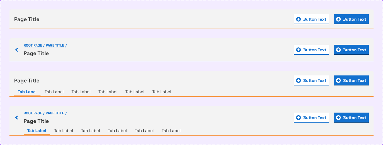
Pages on the legacy version of SwipeSImple web can sometimes make their own path. This, obviously, muddies the users' experience and forces them to acclimate to different behaviors and patterns for each page section. To offset some of these rogue quirks, some rulesets were developed:
All pages have more organized header navigation with actionable breadcrumbs and detailed page names
All pages that have CTAs should have page-level actions contained within the actual header. All other actions are split up and placed in cards
All page content is placed in cards, at the designer's discretion. Pages must have at least one card though.
-
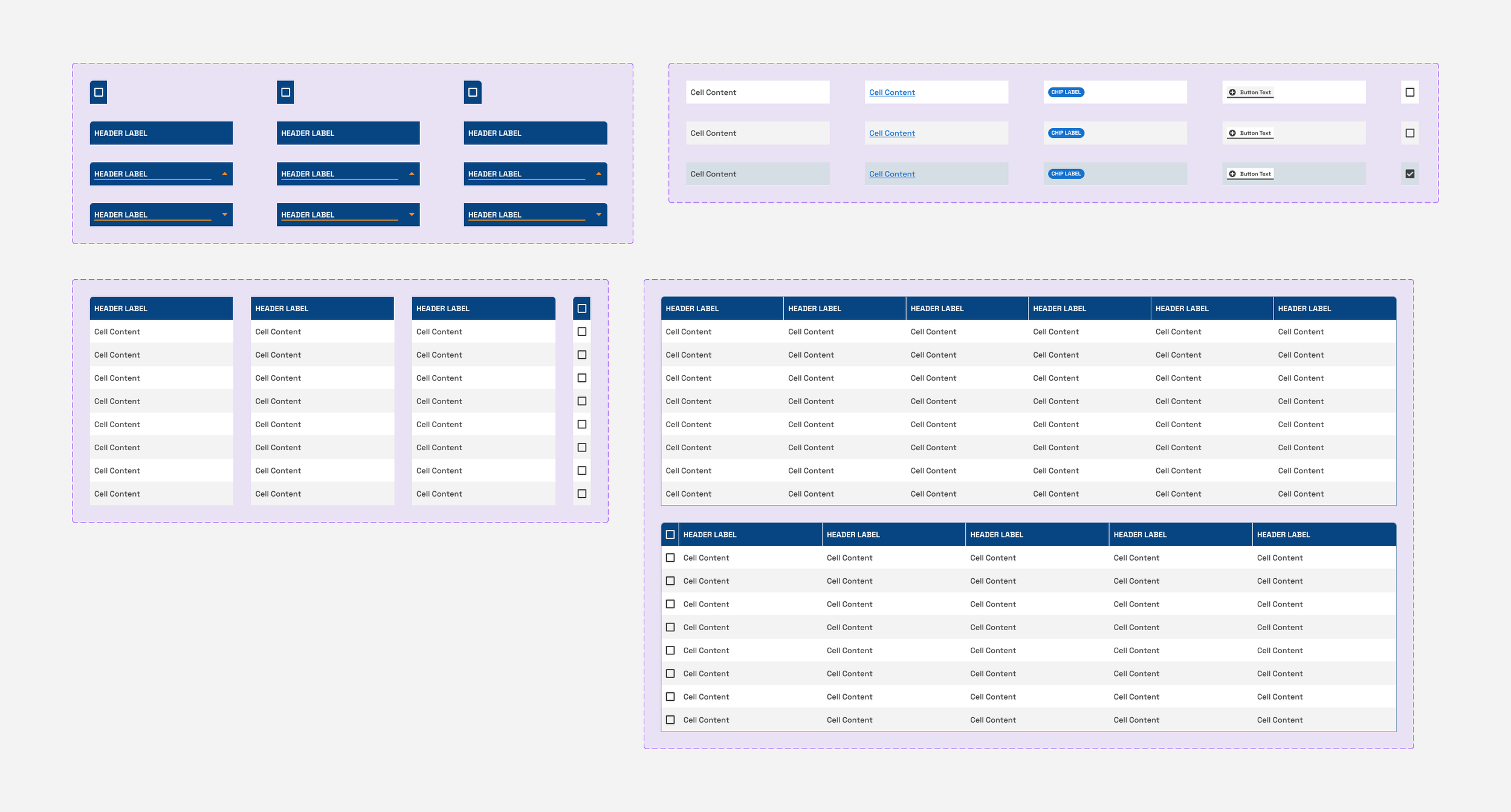
With legacy SwipeSimple, much of it is designed and developed without a system of documented components. Because of this, design time and engineering efforts were increased.
Creating the Tower Control Design System ultimately reduces production and deployment time in two simple steps: housing a robust library of drag-and-drop components for quick designs, and defining a source of truth in documentation for each components structure/build (as well as it's applications)
-
Prior to this work, the SwipeSimple web portal looked the same as when it was originally designed. Though not bad by default, it stands alone in terms of visual cohesion with the rest of any CardFlight-owned software. The SwipeSimple marketing site looks different from the user portal, which looks different from the SwipeSimple mobile experiences.
This visual update allows CardFlight to have a defined "visual language" with the ultimate goal of applying that unilaterally across all experiences.

Looking for improvement
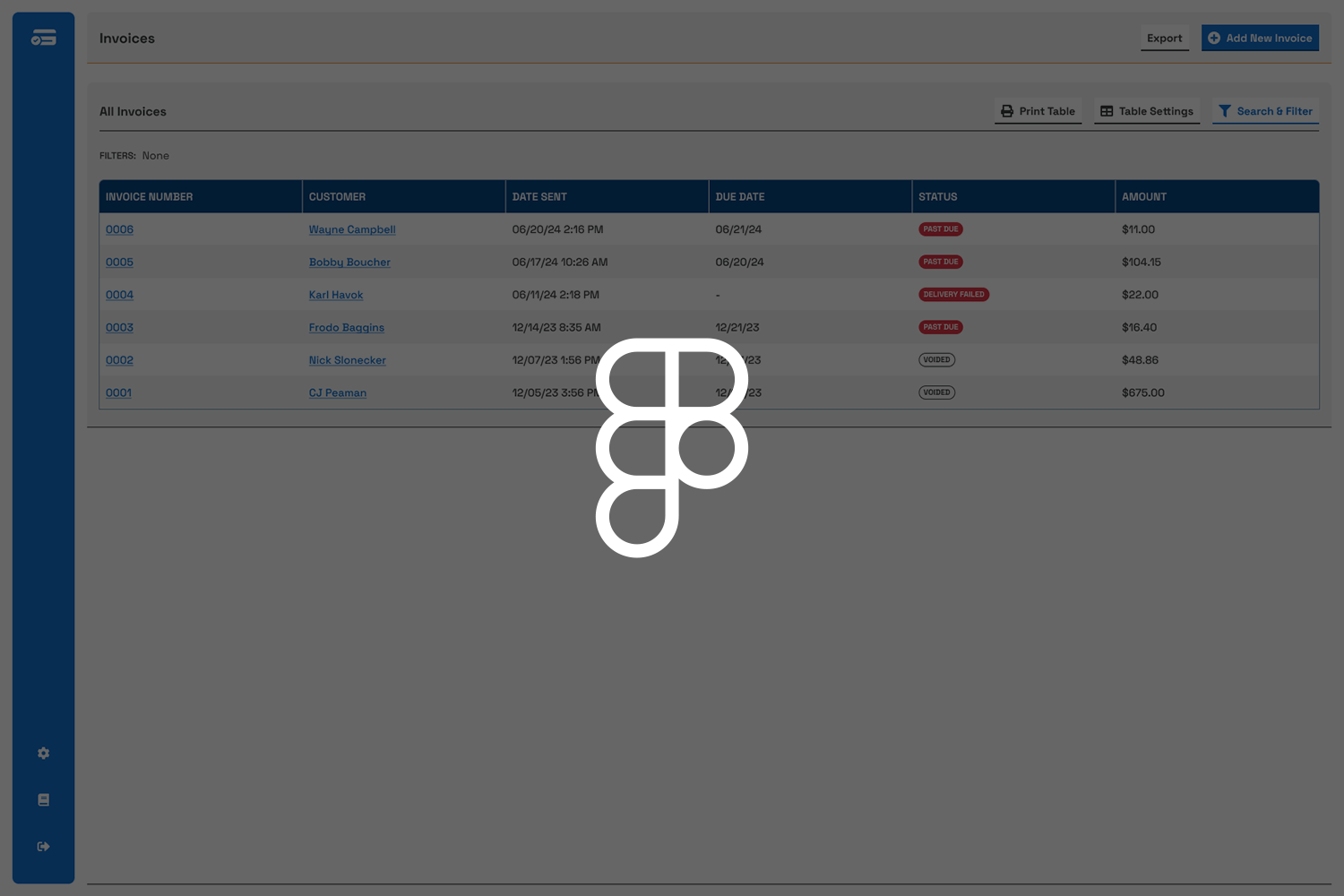
Most of this work was largely un-sanctioned and came about as part of a larger look at SwipeSimple’s product offerings when it came to invoices. After discussing it with a PM, we decided that if Invoices was to be improved it would basically need to be made from the ground up.
Suggesting this would be a great opportunity to pitch a new design, I started re-working the invoices page to show what it could be if we allot some time.


Defining a source of truth
After some research, I decided that the best way to be able to house a design library would be to use a third-party for redlines, documentation, and Figma integration (shout-out supernova.io, you’re a life saver).
As the library was built, I’d write up use-cases for each component, cover every variant, break down the atomic structures, and draw up redlines.
Every component made was carefully documented to be THE source of truth for engineers.